

TL;DR overview
- SonarQube's architecture analysis features help teams understand actual code structure—dependency graphs, component coupling, and layer violations—rather than relying on outdated design documents.
- Visualizing real dependencies surfaces unintended coupling between modules that increases change risk and makes refactoring harder, providing an objective basis for architectural decisions.
- Architecture as code capabilities in SonarQube allow teams to define intended structural rules and automatically flag violations as the codebase evolves.
- Regular architecture reviews using SonarQube metrics help engineering leaders prioritize refactoring efforts based on measurable coupling and complexity data.
A few months ago, we added a capability to manage architecture in SonarQube which comes with the ability to visualize and interact with your project’s current architecture. With this, there’s no need to do code archaeology to try to understand the relations between services, no need for new joiners to go around trying to understand the basics of the application they are building, no outdated diagrams that are “the only thing that we have.” You have access to the accurate architectures of all your applications, thanks to continuous integration that will refresh it during every analysis, with no configuration required.
The basic features
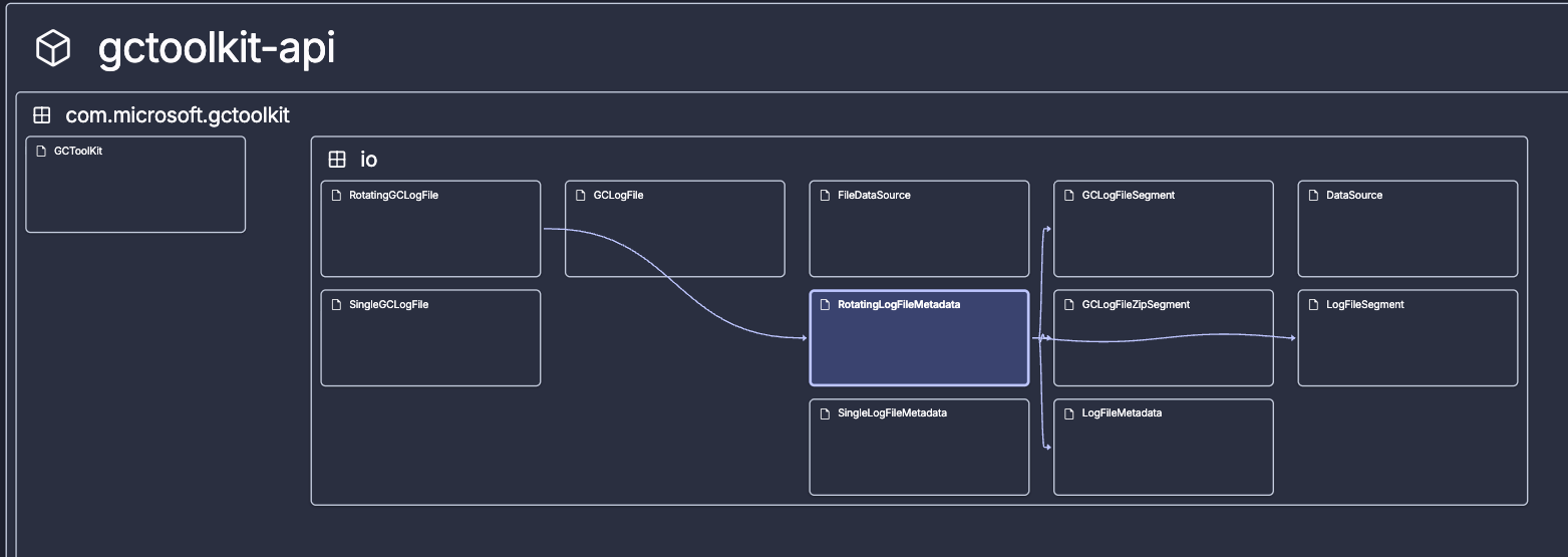
The current architecture map is a visual representation of the components that comprise a project. The layout encodes information. Classes and files are recursively grouped within their packages, modules, or folders. This shows you how your project is organized in terms of structure, the hierarchy of containers, the most basic “what is where.” Components with many children look naturally bigger.
Depending on the programming language, the structure represented corresponds to:
- The logical structure, for example in Java, consists of modules, sub-modules, packages, subpackages, and classes.
- The physical structure, for example in Python, consists of folders, subfolders, and files.
And the map is not just a pretty picture, it is an interactive representation, meaning you can actively explore it:
- You can pan and zoom in and out.
- As you get closer, labels appear, identifying the names of each component.
- You can select a specific component to see incoming and outgoing relationships.
- You can also step back and see things from above, to get a perspective you've never had.
Whether zoomed in or out, you can trace paths through your system, following connections from one component to the next, without reading a single line of code.
Discover and understand. That's the goal.
Isn’t this great? Well, I think it is, but there is actually much more value you can get out of the current architecture!
The advanced features
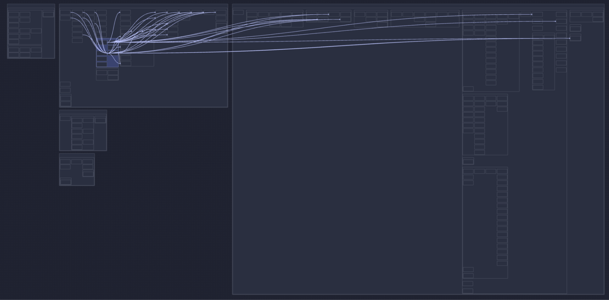
Before going through advanced features, it is important that you understand that the order and position of components on the map are not random. Components are actually ordered very methodically according to their relationships. Here is the algorithm used:
- Starting from the right we position all components that have no outgoing dependencies.
- Components in the same column have no relationships among themselves.
- Components in a column have a least one relation with a component in the next column to the right.
- The above is true at every level in the structure.
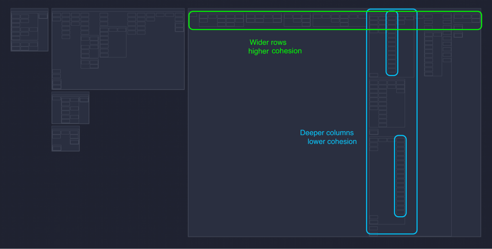
Now that you know this, you can immediately deduct that:
- Dependencies will generally flow from left to right.
- Components on the right have no outgoing dependencies, and are likely your foundational utilities. Changes there ripple to the left.
- Components on the left have no incoming dependencies, they orchestrate the system, and use components on the right; changes there stay local.
- Components stacked vertically are at a similar level of abstraction and are decoupled from each other.
And even more advanced:
- When a column contains only one component, all components in column -1 (the column to the left) depend on it.
- The number of columns minus 1 represents the longest dependency path.
- Wider rows indicate more cohesion, therefore horizontal components contain long chains of components that depend on each other in sequence. This is typical of business logic, with many abstractions, where each one encapsulates knowledge and delegates work to others. You find these often in the middle of your system, sandwiched between entry points and low level utilities.
- Longer columns indicate less cohesion, and vertical components have very little relationships inside, between internal components. This is common in utility packages, that are mostly “a bag of things,” used by the rest of the system. You’ll find these often to the right side of your system, used by lots of components.
- Components that are dense, with little whitespace, which means the internal structure and relationships are homogenous.
- Components that have a lot of whitespace on the contrary, means you have a parent package with a mix of vertical (low coupling) and horizontal (high coupling).
That is it, folks!
If you are not using SonarQube, sign up for SonarQube Cloud today and run your first analysis to see your project structure in minutes. If you're already using SonarQube Cloud but haven't started using the new architecture capability, then enable it now to check out your projects' architecture.